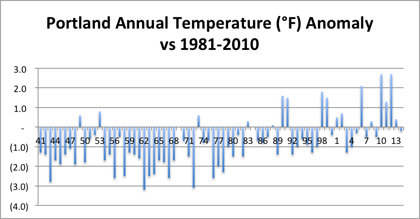
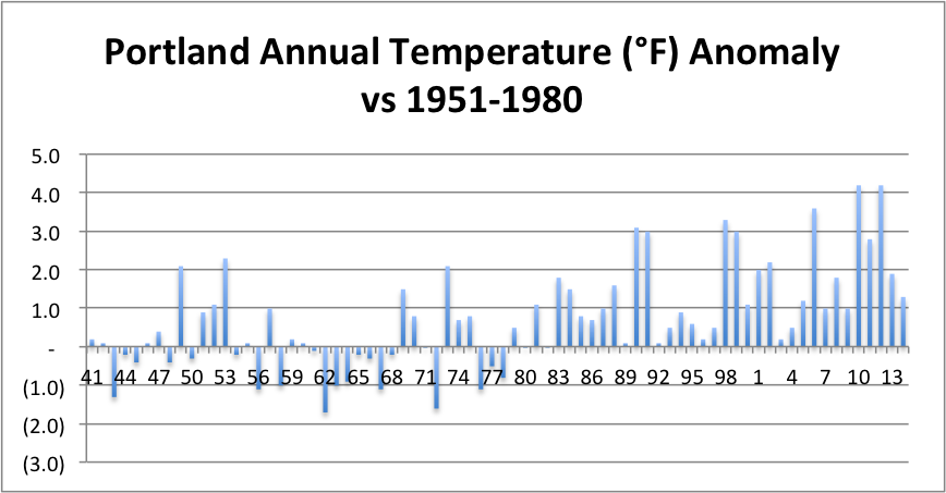
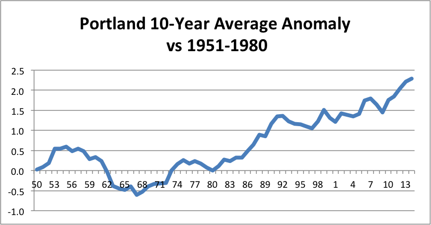
The temperature anomaly graphs below show the difference between the annual average temperature in Portland, according to NOAA, and the average annual temperature in Portland in two 30-year base periods. The first graph uses 1981-2010 as the base, the second one uses 1951-1980. I include the first graph because NOAA currently uses 1981-2010 as the basis for climate and that is the basis for normal temperatures generally referenced in this blog. The graph using 1951-1980 is more useful because it shows the rapid warming since 1980 more clearly. The last year with temperatures below the 1951-1980 average was 1978; the last 36 years have all been at or above the 1951-1980 average! The third graph shows rolling 10-year average anomalies, which have been on the rise since the decade ending 1967. I'll compare these trends to worldwide temperatures once the 2014 averages are published by NOAA.
 RSS Feed
