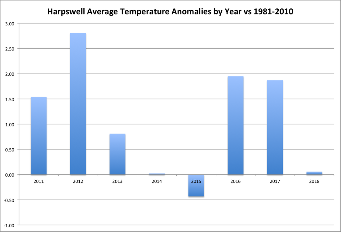
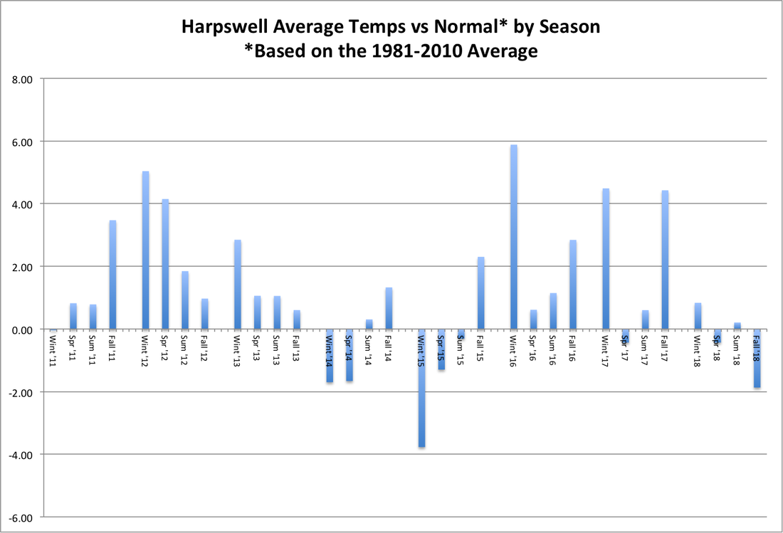
In Harpswell, temperatures were very close to normal during 2018, after two warm years in 2016 and 2017, as shown in the first graph below. Here, and in the second graph, normal is defined by the average during 1981-2010, the 30-year period currently used by NOAA. The second graph shows results by season, which do not line up exactly with years, since the meteorological seasons run from December to November. Fall 2018 was the coldest season, relative to normal, and the coldest since the very cold winter of 2014-15. December 2018 was just about normal, while December 2017 was much colder than normal, tipping the annual results to the warm side despite the four seasons averaging slightly on the cool side.
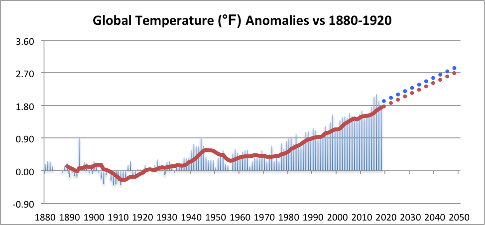
Worldwide temperature anomalies, which were recently release by NOAA, are shown in the third graph, relative to the pre-industrial period 1880-1920. As reported by NOAA, 2018 was the 4th warmest period since global records have been kept, only surpassed by 2015-17. The graph also projects future temperature anomalies if current trends continue. The blue dots follow the annual trend since 1970 and the red dots follow the trend in 10-year averages since 1980. The projections go out to 2050 and the scale shows the key numbers from the Paris Agreement: plus 2.7 and 3.6 degrees Fahrenheit over the pre-industrial period. Specifically, the goals of the Paris agreement were: "Holding the increase in the global average temperature to well below 2°C (3.6°F) above pre-industrial levels and to pursue efforts to limit the temperature increase to 1.5°C (2.7°F) above pre-industrial levels, recognizing that this would significantly reduce the risks and impacts of climate change." On current trends, which have been quite steady for 40-50 years, we will hit +2.7°F between 2045 and 2050.
Worldwide temperature anomalies, which were recently release by NOAA, are shown in the third graph, relative to the pre-industrial period 1880-1920. As reported by NOAA, 2018 was the 4th warmest period since global records have been kept, only surpassed by 2015-17. The graph also projects future temperature anomalies if current trends continue. The blue dots follow the annual trend since 1970 and the red dots follow the trend in 10-year averages since 1980. The projections go out to 2050 and the scale shows the key numbers from the Paris Agreement: plus 2.7 and 3.6 degrees Fahrenheit over the pre-industrial period. Specifically, the goals of the Paris agreement were: "Holding the increase in the global average temperature to well below 2°C (3.6°F) above pre-industrial levels and to pursue efforts to limit the temperature increase to 1.5°C (2.7°F) above pre-industrial levels, recognizing that this would significantly reduce the risks and impacts of climate change." On current trends, which have been quite steady for 40-50 years, we will hit +2.7°F between 2045 and 2050.
 RSS Feed
